Upgrade your web presence with Framer

Elevate Your Experience.
Get Started Now.

Elevate Your Experience.
Get Started Now.

Schedule a call with Goran B.

Schedule a call with Goran B.

Babarogic © 2023. Designed by Goran Babarogic

Babarogic © 2023. Designed by Goran Babarogic

Babarogic © 2023. Designed by Goran Babarogic

Streamlit Project: analysis of revit model on web

Streamlit Project: analysis of revit model on web

Streamlit Project: analysis of revit model on web

Elevate the user experience and visual appeal of your comparison site with our expert UX/UI design services. We specialize in creating intuitive interfaces

What is Streamlit?

Streamlit is an awesome new tool that allows engineers to quickly build highly interactive web applications around their data, machine learning models, and pretty much anything.

Streamlit is the most effortless way particularly for individuals with no front-end information to put their code into a web application:

  • No front-end (html, js, css) involvement or information is required.

  • You do not have to be spend days or months to make a web app, you'll be able make an extremely wonderful machine learning or information science app in as it were a couple of hours or indeed minutes.

  • It is congruous with the lion's share of Python libraries (e.g. pandas, matplotlib, seaborn, plotly, Keras, PyTorch.

  • Information caching streamlines and speeds up computation pipelines.

Set it up

# StreamlitApp.py
# import the library 
import streamlit as st 

# add title to your app 
st.title ("this is the app title") 
st.header("this is the markdown") 
st.markdown("this is the header") 
st.subheader("this is the subheader") 
st.caption("this is the caption")

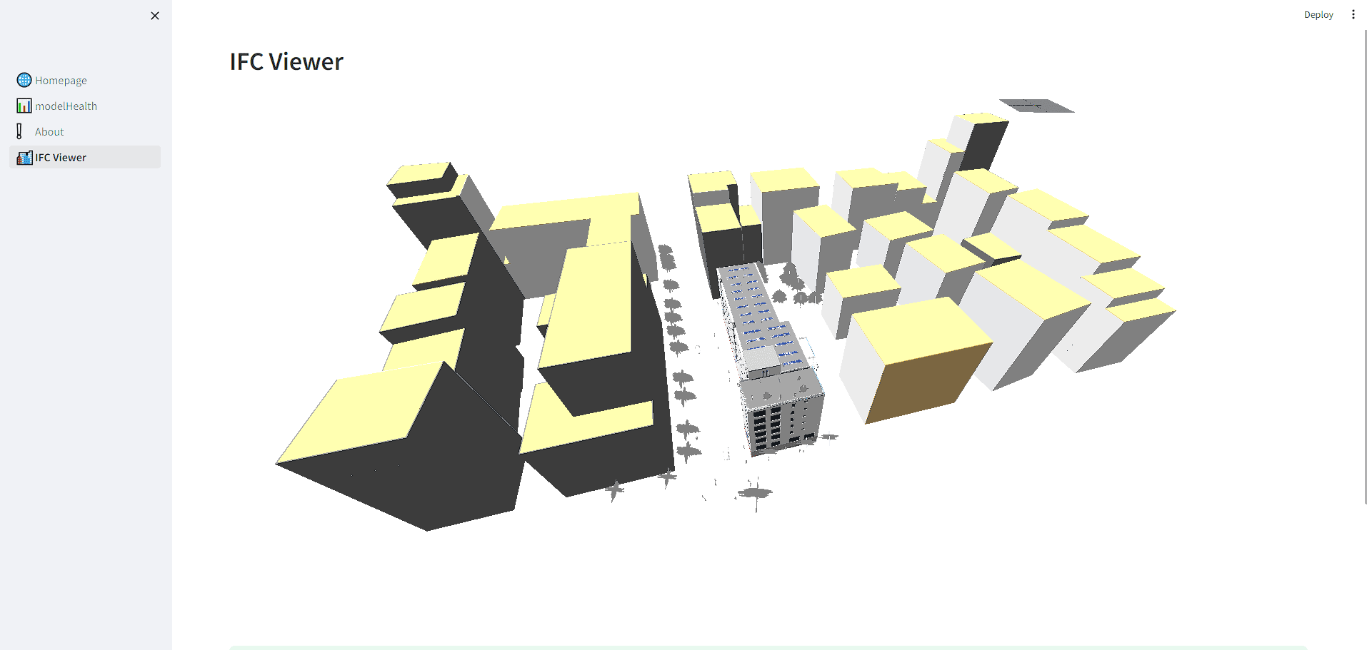
Visualization for Revit Data

Firstly, we need to extract the revit data from the model as an excel file. I used this data file for the rule-based checks of the model. extracting the data in an order suitable for examination makes it much easier for us to analyse.

Here is some of my code I wrote in python to create a web application this way:

import streamlit as st
import plotly.graph_objects as go
import pandas as pd

st.title("Revit Model Health Check")
# Create Radio Buttons
options = st.radio(label = 'CONTROL', options = ['Family Name','Material Name','Assembly Code','Room Status'])
st.write('<style>div.row-widget.stRadio > div{flex-direction:row;}</style>', unsafe_allow_html=True)

def gauge_chart(value, title):
    if value <= 30:
        color = "red"
    elif value <= 70:
        color = "yellow"
    else:
        color = "green"

    fig = go.Figure(go.Indicator(
        mode="gauge+number",
        value=value,
        title={'text': title},
        gauge={
            'axis': {'range': [0, 100]},
            'bar': {'color': color},
            'bgcolor': "white",
            'borderwidth': 2,
            'bordercolor': "gray",
            'steps': [
                {'range': [0, 30], 'color': 'white'},
                {'range': [30, 70], 'color': 'white'},
                {'range': [70, 100], 'color': 'white'}
            ],
            'threshold': {
                'line': {'color': "black", 'width': 4},
                'thickness': 0.75,
                'value': 80
            }
        }
    ))

    return fig

# MODEL DATA EXTRACTION FROM EXCEL
...
...

# creating gauge graph
#fig = gauge_chart(revit_puan, "Model Health")
#st.plotly_chart(fig)


def familyname(dataframe):

    st.markdown(""" <style> .font {
        font-size:30px ; font-family: 'Black'; color: #FF9633;} 
        </style> """, unsafe_allow_html=True)

    st.markdown('<p class="font">RESULT</p>', unsafe_allow_html=True)
  
    fig = gauge_chart(P_familyname, "Model Health")
    st.plotly_chart(fig)

def materialname(dataframe):

    st.markdown(""" <style> .font {
        font-size:30px ; font-family: 'Black'; color: #FF9633;} 
        </style> """, unsafe_allow_html=True)

    st.markdown('<p class="font">RESULT</p>', unsafe_allow_html=True)

    fig = gauge_chart(P_materialname, "Model Health")
    st.plotly_chart(fig)

def assemblycode(dataframe):

    st.markdown(""" <style> .font {
        font-size:30px ; font-family: 'Black'; color: #FF9633;} 
        </style> """, unsafe_allow_html=True)

    st.markdown('<p class="font">RESULT</p>', unsafe_allow_html=True)

    fig = gauge_chart(P_assemblycode, "Model Health")
    st.plotly_chart(fig)

def RoomStatus(dataframe):

    st.markdown(""" <style> .font {
        font-size:30px ; font-family: 'Black'; color: #FF9633;} 
        </style> """, unsafe_allow_html=True)

    st.markdown('<p class="font">RESULT</p>', unsafe_allow_html=True)

    fig = gauge_chart(P_RoomStatus, "Model Health")
    st.plotly_chart(fig)

....
....

if options == "Family Name":
    familyname(P_familyname)
elif options == "Material Name":
    materialname(P_materialname)
elif options == "Assembly Code":
    assemblycode(P_assemblycode)
elif options == "Room Status":
    RoomStatus(P_RoomStatus)
...

...

df = pd.read_excel("ModelData.xlsx") 
st.write(df)
...
...


Full code is here: https://github.com/OnurKorkmaz1

Conclusion

There are some programs to analyse Revit models, but the flexibility of these programs is quite low. Since there are different definitions and rules in large projects, we need to use different methods to analyse and visualise the data. An automatic reporting system using streamlit and python will be very useful.